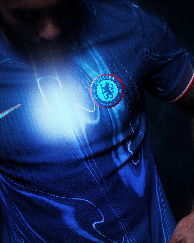
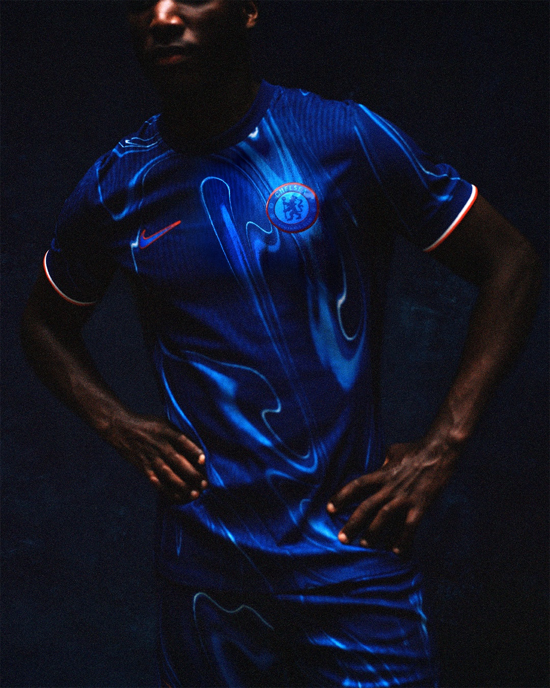
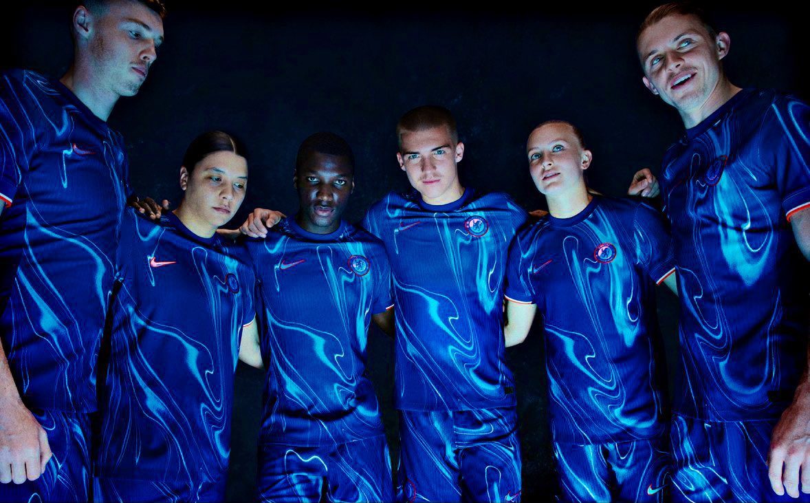
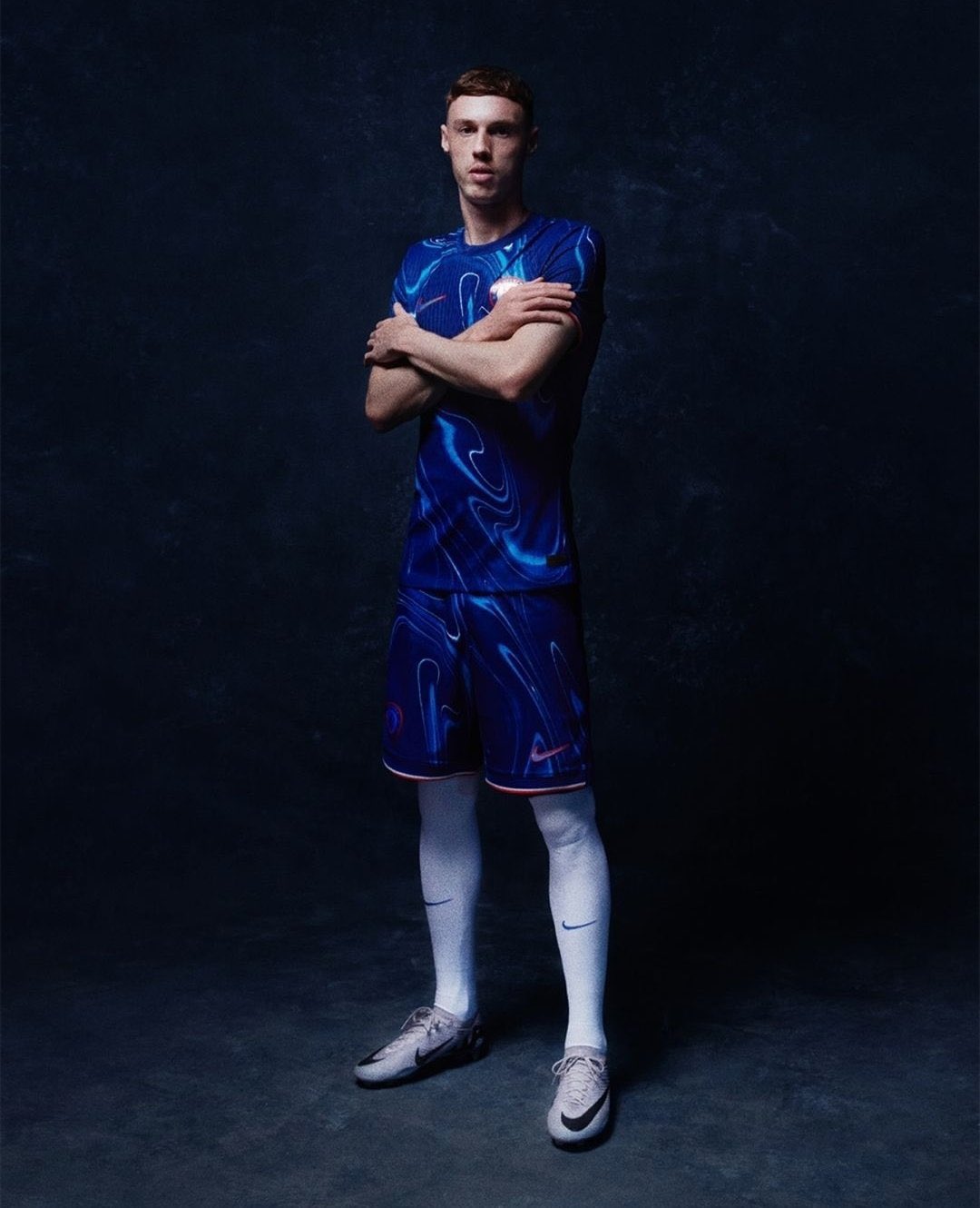
Manufactured by Nike, the kit showcases a striking ‘blue flame’ theme that covers both the shirt and shorts.
The design is centred around the concept that “the hottest part of the flame burns blue,” with a swirling, shimmering graphic laid over a vibrant blue background.
According to the club via social media on Monday, this flame graphic symbolises the “melting pot” of London culture, while the flecks and ripples of liquid silver represent Chelsea’s rich history and success.
Adding to the fiery motif, thin white and bright orange trim on the sleeves and shorts provide contrast and are described as a nod to the “fresh fire coming through the club’s youth ranks” at their Cobham training centre.
The kit also features an iridescent, embossed club crest and logos, carried over from last season’s jersey but now tinted in silvery blue rather than gold.
Upon its launch, the new design has divided opinion among Chelsea supporters on social media, with some quick to label it as “historically bad.” However, the club reminds fans of previous controversial designs, such as the “Op Art” shirt from the 2021-22 season.
Interestingly, the new kit currently lacks a main sponsor across the front of the shirt. Chelsea’s agreement with sports technology company Infinite Athlete, reportedly worth £40 million, expired at the end of last season.
This situation mirrors last summer when the Blues started the 2023-24 campaign without a shirt sponsor, only securing a deal with Infinite Athlete six weeks into the season.


