


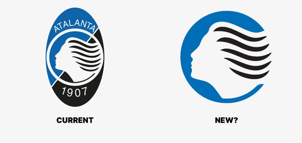
Italian Serie A club Atalanta BC have officially unveiled a brand-new minimalist logo set to debut on the club’s kits and merchandise from the 2026-27 season.
The redesigned crest features a clean circular design centered around the iconic Goddess profile, a symbol long associated with the club’s identity. In the updated version, Atalanta removed the traditional oval shape, club name, and founding year, replacing them with a solid blue background, a white Goddess figure, and flowing black hair.
According to the club, the new design pays homage to Atalanta’s historic circular badge used between 1980 and 1993, while also embracing a more modern and versatile visual identity suitable for digital branding and single-color applications.
The announcement has already sparked reactions among football fans online, with some praising the sleek and modern appearance, while others expressed nostalgia for the club’s traditional crest.

Atalanta BC have grown significantly in global recognition in recent years following impressive performances in Serie A and European competitions, making the rebrand part of the club’s evolving international image.
GATMASH NEWS
…News That Drives Impact
For advert placements and business inquiries, kindly reach us via:
📧 Email: [email protected]
📞 Tel/WhatsApp: +234 (0) 807 202 2024
We value your voice! Share your stories, eyewitness reports, and contributions with us anytime:
📲 SMS/WhatsApp: +234 (0) 807 202 2024
📧 Email: [email protected]
Visit us online: https://gatmash.com